"Mario & Luigi: Brothership - Nintendo Rejects Edgier Version"
Author: Aiden
Jun 28,2025

The beloved plumber duo Mario and Luigi almost took a bold, edgier turn in their latest adventure—but Nintendo ultimately decided to keep things classic. Discover how the art direction for Mario & Luigi: Brothership evolved during development.
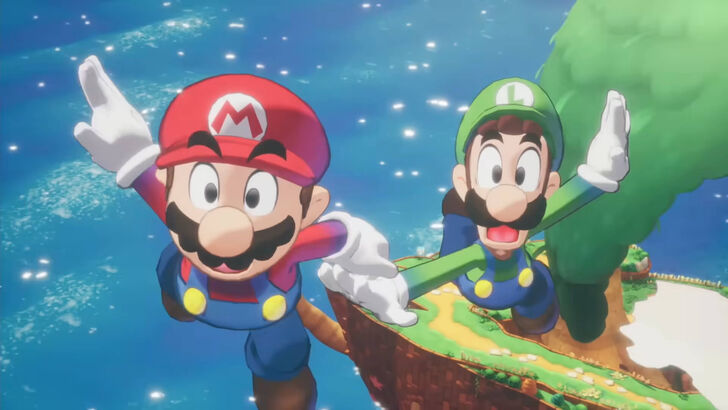
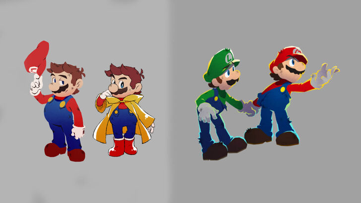 Image from Nintendo and Acquire
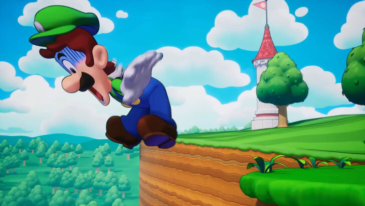
According to an Ask the Developer article published on Nintendo’s website on December 4th, the team at Acquire initially explored a more rugged and edgy look for Mario and Luigi. However, Nintendo stepped in with feedback indicating that such a drastic change risked losing the characters’ iconic identity.
The developers involved included Akira Otani and Tomoki Fukushima from Nintendo’s Entertainment Planning & Development Department, along with Haruyuki Ohashi and Hitomi Furuta from Acquire. Their goal was to create a unique 3D visual style that would highlight the charm of the Mario & Luigi series while differentiating it from other Mario titles.
At one point in development, designer Hitomi Furuta revealed that the team experimented with a notably edgier version of Mario. “And in our search for a new Mario & Luigi style, at one point we ended up trying to present an edgier, more rugged Mario instead…” she shared with a laugh. However, after receiving input from Nintendo, the team realized they needed to stay true to the recognizable essence of Mario and Luigi.
Nintendo provided a guiding document outlining what makes the brothers uniquely identifiable as characters. “Although we'd enthusiastically pitched this rugged version of Mario, when I considered it from a player's perspective, I started to worry about whether it really represented the Mario that players would want to play,” Furuta admitted. With clear direction from Nintendo, the team refocused their creative efforts.
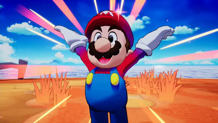
Haruyuki Ohashi explained how the team eventually found a balance: “We were able to narrow down our focus to how we could combine two things: the appeal of illustrations featuring solid outlines and bold, black eyes, and the charm of pixel animations depicting the two characters moving around comically in all directions. I think that's when we finally started to develop an art style that's unique to this game.”
Nintendo’s Akira Otani added, “While we wanted Acquire to have their own unique style, we also wanted them to preserve what defines Mario. I think it was a period when we were experimenting with how those two things could coexist.”
Acquire is best known for its work on visually distinct and often darker JRPGs like Octopath Traveler and Way of the Samurai. As Furuta noted, the studio tends to lean toward heavier, more serious aesthetics by default. Creating a title under the colorful and globally recognized Mario brand posed a unique challenge.
Additionally, developing a game starring characters owned by another company was relatively new territory for Acquire. Despite these challenges, the collaboration proved fruitful. “Although we were still getting to grips with the mood in the Mario & Luigi series, we decided on this direction so we wouldn't forget that it's a stage for fun, chaotic adventures. This doesn't only apply to the game's world, but we learned a lot from Nintendo's unique design perspective about making things easier to see and understand. The world turned out brighter and easier to play due to the insights we gained.”